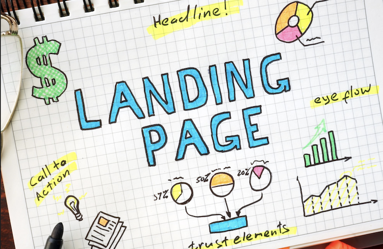
Inbound marketing is a strategy that uses content such as blogs, articles, and social media posts to attract potential customers to your website. This article shows you how to create an effective landing page so once they arrive on your website, you can then use targeted content and calls-to-action to convert them into leads and customers.
One of the most important components of inbound marketing is the landing page. This is the page that your potential customers see when they click on one of your links or ads. It’s important to create an effective landing page so that you can convert as many visitors into leads as possible.
In this blog post, we’ll discuss how to create an effective landing page for your inbound marketing campaign.
According to a Hubspot study, the more you offer landing pages, the more you generate Leads.
When you go from 10 to 15 landing pages, for example, you generate 55% additional leads. This is pretty good news for your inbound marketing strategy!
However, the content of this page must meet a specific objective and above all, lead the visitor to transform into a prospect. Its ultimate goal remains to increase the conversion rates for your marketing campaigns while reducing your acquisition costs.
So how do you create an effective landing page for your inbound marketing strategy? We tell you everything!
Creating a landing page: a crucial step in the Inbound Marketing
An essential element of your inbound marketing strategy, a landing page captures the attention of visitors to turn them into leads. Leads that will integrate your nurturing campaigns in order to convert into customers.
This is the keystone of your sales and your turnover.
By its unique format, dedicated to conversions :
A Landing Page captivates the prospect’s attention
The reference pages increase conversions because they are free from distractions. They have neither FAQ nor external links and sometimes they don’t even have a menu bar. The only content is the message you want to convey to the visitor. The latter therefore focused on your titles, arguments, and call-to-action, which facilitates its conversion.
A Landing Page personalizes the message
Motion matching is an important step in eliminating distraction or doubt in the visitor.
As each landing page is modeled on a specific campaign, it necessarily meets an equally specific need. This is not always the case with your category pages or blog articles, for example.
The landing pages are personalized to match an advertisement. They use the same branding, the same colors, the same fonts, and the same message. Customers who land there understand that they are in the right place, that they will have the answer to their expectations, and are sensitive to the content you offer them. They are therefore more qualified to go through with the conversion.
A Landing Page promotes the collection of prospecting data
On the landing page, visitors must complete a form. Although the information requested varies depending on the company, it still serves your inbound marketing strategy.
Beyond the contact data, it is common to request information used to qualify the prospects: position occupied, place of residence, the objective of life or professional, size of the company, number of children … In summary, all the data you need to segment them more effectively!
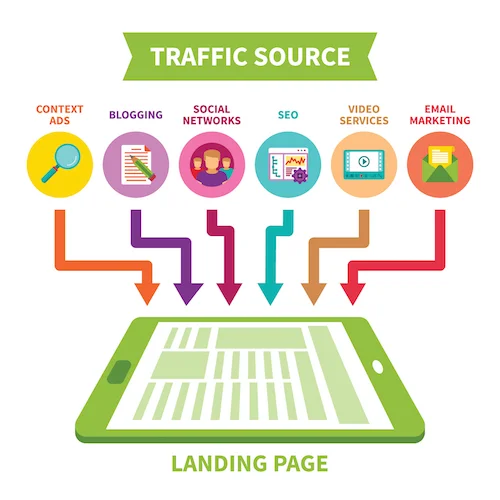
They also help your sales team to conduct their business conversations, as well as to adapt their offers. The goal is always the same: improve sales.
When to create a landing page in your Inbound Marketing strategy?
Whenever a marketing campaign links to your site, you need a landing page. You can create unique reference pages for:
Your products or services
When visitors arrive on your site, they land on the home page or on a product sheet. These are ideal for presenting your brand or providing information on the items sold. However, they do not necessarily provoke action.
In reality, visitors who land on a product sheet have an additional 72% chance of bouncing compared to those who land on a landing page. As we saw earlier, the latter keeps the visitor’s attention, keeps it on your site, and launches its purchasing experience.
A landing page for a product has clear and concise content so that the value proposition is easy to understand. It is the link between the time a customer sees your advertising campaigns for the first time and the time he goes to your online store and concludes the deal with a purchase.
Apple is very strong at transforming its product sheets into real landing pages prompting conversion:
Your downloadable content
Ebooks, white papers, webinar replay’s, templates, or other downloadable content are perfect tools for collecting leads. To promote them and encourage visitors to download them, you can create a captivating landing page (we will see how in the rest of this article).
For example, Hootsuite created landing pages to promote its reports:
Your events (online or offline)
Do you want to encourage registration for your event? A landing page is ideal for stimulating ticket sales or registrations.
On these pages, visitors can consult all the details of the event and request to receive additional details. The objective is to collect email addresses to contact registrants when approaching the date or once tickets are sold, for example. You can also take the opportunity to dedicate an Inbound Marketing campaign to them by sending them your content related to the theme of the event.
Your paid campaigns
Do you launch Google Ads campaigns or sponsored content on social networks? If the goal is to boost the acquisition of leads, remember to create a landing page for each advertisement.
The latter must be an extension of your advertising, in order to keep the visitor and subtly lead him to conversion.
Your emails
Emailing and landing page campaign here is the perfect duo for effective inbound marketing!
Your audience makes purchasing decisions as they move into your sales funnel. For each of your strategic emails, go back to a landing page that meets the needs of your prospect, as well as its maturity.
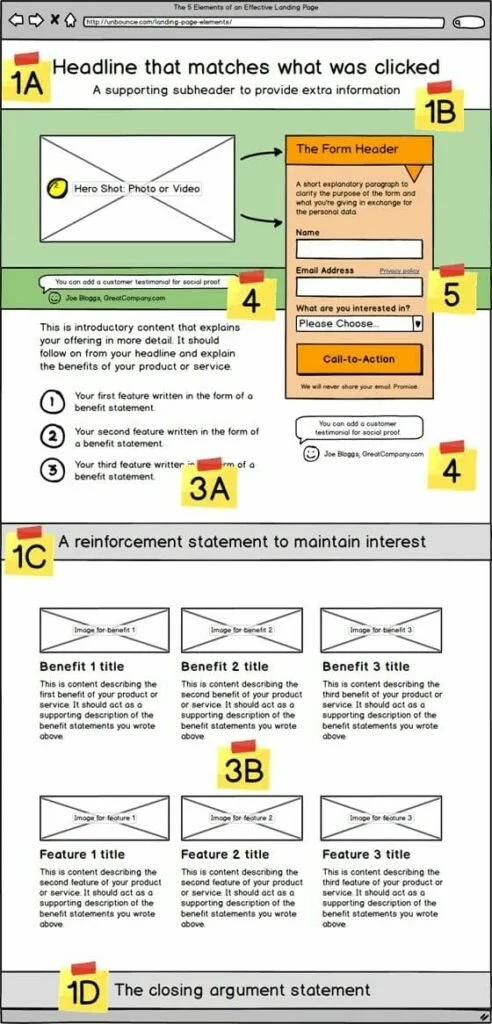
The objective of this landing page will be to collect additional data (by asking it for new information in the form) or to lead to conversion (by inviting it to test your offer or buy a product at a price reduced).
How to create an effective landing page for your Inbound Marketing strategy?
The average conversion rate for landing pages is around 2.35%. For the 10% of the best-performing sites, this rate is at least 11.45%.
How to build an efficient landing page? Here are 6 tips to apply!
1. Use headers to spread the value proposition
A good landing page offers a solid offer and explains it in clear and concise terms. The title and subtitles of the landing page provide a key opportunity to promote your value proposition.
Remember that you only have 7 seconds to convince users. It is absolutely essential that the advantages of your offer be seen in the front lines.
This Airbnb landing page illustrates this example perfectly. In one line, we understand the proposal and what we can gain by choosing to become an Airbnb host. The vibrant pink CTA in the header makes it easy to convert on the spot.

2. Adapt the landing page to each channel
Generally, when you launch an inbound marketing campaign, you use several channels. However, a user who arrives on your landing page from a Facebook publication is in a different state of mind than the one who clicks on your Google Ads ad or in the link in your monthly newsletter.
Remember to customize the format of your landing pages for these different audiences, as well as the forms! A subscriber to your newsletter has already given you information about him. No need to ask him the same thing again! Take the opportunity to qualify it more.
Also, think of mobile uses: a visitor from social networks is likely to sail from his smartphone. Your call-to-action and form must adapt to a consultation on a small screen.
3. Make the form appear shorter
Logic would be that you minimize the size of your form to request only the information that is strictly necessary.
However, for the sake of your inbound marketing, it is advisable to collect data that will help with the qualification.
The solution so as not to discourage visitors? Avoid vertical forms!
Divide it into two columns instead. The form will thus appear shorter.
This is the technique used by the Benchmark platform to better pass its form comprising 10 fields …
Bonus advice: include a formula like: “This form will only take X seconds to complete ! “. This may give additional encouragement to the hesitant visitor!
4. Take care of the design of your page
A successful landing page is minimalist, attractive, and dynamic. It presents information in a constructive and above all, non-intrusive manner. Avoid pop-ups and other animations that can distract the visitor’s attention.
Also, opt for a simple and refined design, with lots of white space. The goal is for visitors to stay focused on your offer and your call to action.
Choose a comfortable font, not to mention playing with the size of the text. Important information, such as titles, quotes, or statistics, should be displayed in a higher font and put in bold.
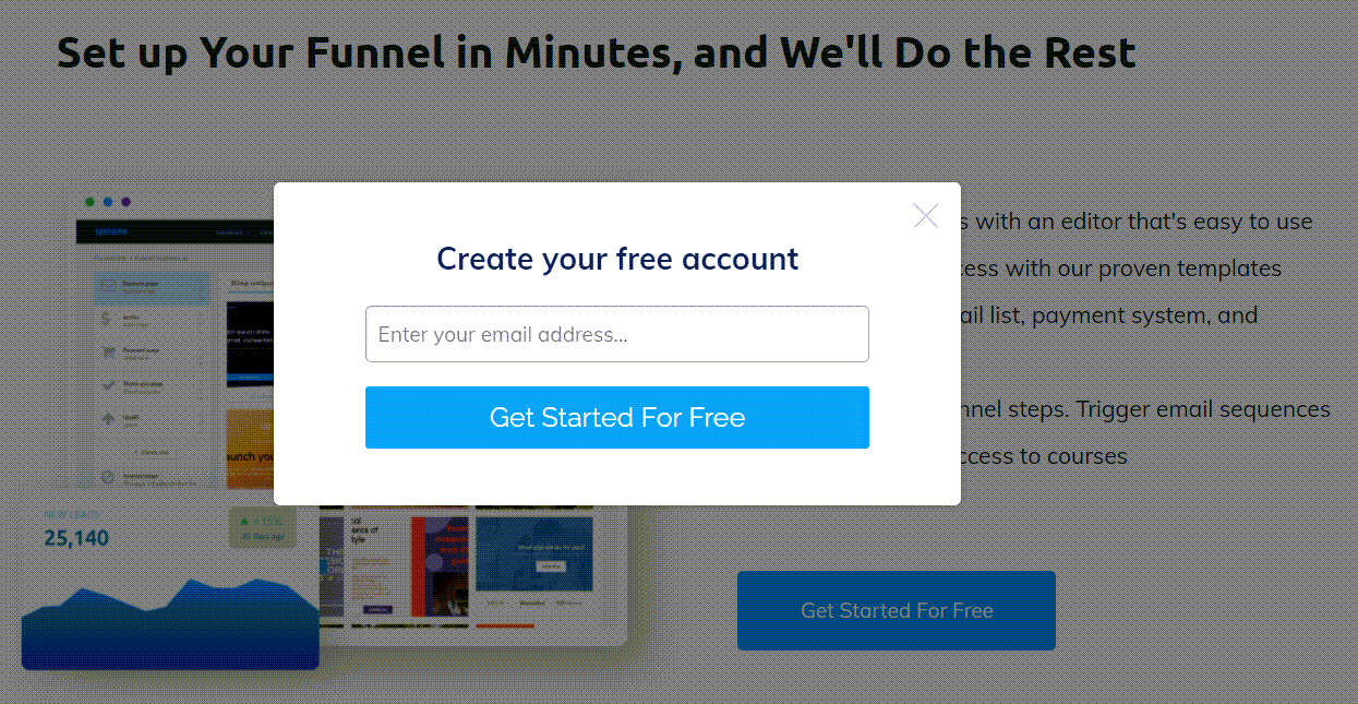
This example from the Systeme platform perfectly illustrates a high converting landing page. The design is simple, click a button and just your email is required for a fast and frictionless conversion.
5. Opt for dynamic scrolling
Make sure your design does not increase the loading time of the page. 1 second late can reduce conversion by 7%!
The more interested visitors are in your offer, the more they will scroll through your page. The idea is therefore to opt for a load in real-time, as they unfold the contents.
Also, do not skimp on the length of your landing page!
Landing pages well supplied with information can generate up to 220% more prospects than calls to action located above the fold of the page.
6. Ensure conversion with an impactful call for action
When writing the call to action, use words that inspire your visitors. It is recommended to favor strong control verbs, figures, and terms that cause emotion.
With regard to the design of the CTA, the font must be clearly legible and consistent with the page. However, it should appear slightly larger than the text of the description.
Regarding its color, the button must come off the page, while remaining in shades consistent with your graphic charter and your product universe.
4 tools to create an effective landing page
There are turnkey solutions to create effective landing pages. In addition to making it easier for you to create and design, these tools generally offer statistics allowing you to analyze the performance of your page. The goal is to detect what works and what needs to be improved to increase your conversions.
1. Systeme
Speed up the process with proven templates. Integrate your email list, payment system, and membership sites. Automate your funnel steps. Trigger email sequences and give instant access to courses. With Systeme, you can set up your funnel in minutes.
2. Aweber
Being one of the longest established email automation providers, they know their stuff when it comes to landing pages. AWeber’s Landing Page Builder is a landing page creation tool. It has everything you need to get started, promote, and sell products. Each single web page template is created specifically for use to take a particular action.
3. Lead Pages
Lead Pages connects to your CRM, as well as to your other marketing tools. It helps you develop successful pages to increase your conversions. You can choose a model to customize or create your content from A to Z.
4. Architect for WordPress
Thrive Architect is not the only visual editor for WordPress, but it’s the only one that is laser-focused on business websites — built by and for DIY entrepreneurs. It’s a quick, simple, and effective way to quickly create your landing pages!
You have all the keys in hand to perfectly integrate the landing pages into your inbound marketing strategy! The 4 tools above all have split and A / B testing functions. With Systeme & Thrive Architect they can automatically choose to show the highest converting pages for you.
I hope you find these tips on how to create an effective landing page useful. As always, don’t hesitate to keep testing several versions of your pages to find the formula that generates the most conversions.
