Ever wondered why some YouTube videos get a lot of views while others don’t? It’s often because of the thumbnails. In the busy world of YouTube, eye-catching thumbnails can make people click or ignore your video. Making a thumbnail that grabs attention is key to getting your video seen by more people. By exploring different ideas for YouTube thumbnails, you can catch your audience’s eye and boost your channel’s success.
Key Takeaways
- Thumbnails play a vital role in attracting clicks and driving views on your YouTube videos.
- A high-definition thumbnail should be 1280 x 720 pixels to meet YouTube’s best practices.
- Using images of faces with eye contact can create a stronger connection with viewers.
- Consistency in design elements helps in establishing brand identity on YouTube.
- Bright backgrounds and contrasting colors enhance visibility and viewer attraction.
The Importance of Thumbnails in YouTube Success
Thumbnails are key to YouTube success. They are the first thing viewers see and decide if they want to watch your video. Good thumbnails make your brand stand out and build trust with viewers.
Using YouTube clickbait thumbnails can really help your video get more views. Most top videos have custom thumbnails that grab attention. Your thumbnail should show what your video is about and make people want to watch.
Good video thumbnail design tips are important for keeping viewers interested. Being consistent with your brand can increase your earnings by over 20%. Make sure your thumbnails are the right size and shape so they look good on all devices.
Check your YouTube Analytics often to see how people react to your thumbnails and titles. This info can help you make better choices for more engagement. It’s important to keep up with changing trends and know what your audience likes.
| Key Aspect | Details |
|---|---|
| Engagement | Thumbnails significantly drive viewer engagement by attracting clicks. |
| Revenue Impact | Consistent branding through thumbnails can boost revenue over 20%. |
| Resolution | Best practice thumbnail size is 1280 x 720 pixels for optimal display. |
| Top Videos | 90% of top-performing videos leverage customized thumbnails. |
| Audience Trust | Coherent and recognizable thumbnails enhance brand perception, increasing viewer loyalty. |
Understanding YouTube Video Thumbnail Sizes
Knowing the basics of YouTube video thumbnail sizes is key to getting more views. YouTube suggests a thumbnail resolution of 1280 x 720 pixels. This size keeps your thumbnails clear on different screens. Make sure the width is at least 640 pixels for mobile users.
For the best thumbnail, use a 16:9 aspect ratio. This fits the player well and looks good on all devices. It’s important for optimizing for different devices, where screens are often smaller.
Don’t let your thumbnail file size get bigger than 2MB. Use formats like .JPG, .GIF, .BMP, or .PNG. A well-sized thumbnail looks clear and grabs attention fast.
Successful creators often use bright colors and clear images in their thumbnails. Keep your design simple and easy to read. Following these tips can boost your click-through rates, making thumbnails a key part of your YouTube plan.
| Aspect | Recommendation |
|---|---|
| Resolution | 1280 x 720 pixels |
| Minimum Width | 640 pixels |
| Aspect Ratio | 16:9 |
| Maximum File Size | 2MB |
| Accepted Formats | .JPG, .GIF, .BMP, .PNG |
YouTube Video Content Ideas for Creating Engaging Thumbnails
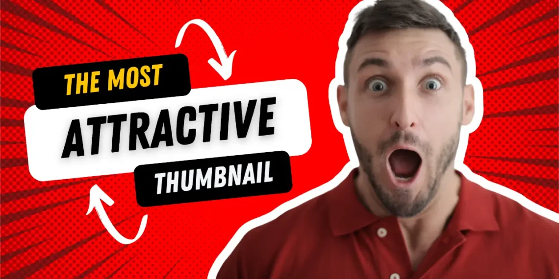
Creating custom YouTube thumbnails is key to connecting with your audience. Use vibrant colors and show human emotions like facial expressions. High-quality images make your thumbnails stand out and build a personal connection.
Adding text to your thumbnails gives more context and makes them more eye-catching. Shocking faces, big objects, and action shots grab attention. The YouTube algorithm likes engaging thumbnails, helping you reach more people.
Keeping your thumbnails looking the same helps with branding. This makes it easier for viewers to recognize and trust your content. Popular thumbnails often feature celebrities, action, humor, or nostalgia.
High-quality thumbnails are crucial for success. The right visuals can increase watch time and clicks. Questions or before-and-after images can make people curious and click on your video. For more tips on YouTube success, check out effective strategies for small businesses. These ideas tap into the psychology of thumbnails, sparking curiosity and engagement.
Tips for Effective Video Thumbnail Design
Creating a striking YouTube thumbnail is key to drawing in viewers and boosting engagement. It’s all about a few core principles that make your content pop. Let’s dive into strategies like using high-quality visuals, bold fonts, and the power of color contrast.
High-Quality Visuals
High-quality visuals in your thumbnails are a must for catching eyes. They represent your brand and content, so poor images can hurt viewer trust. Stick to YouTube’s recommended resolution of 1280 x 720 pixels for sharp, vibrant images. A strong visual identity boosts recognition and quickly conveys what your video is about.
Using Bold Font Styles
Bold font styles make text clear and catch the eye. Keep font choices to three or less to avoid clutter. Choose bold, simple fonts for quick and effective messaging. On smaller screens, less text works best, making it easier for viewers to understand your video’s topic. This increases the chance of them clicking on your video.
Implementing Color Contrast
Color contrast is key for making thumbnails pop. Use complementary colors to highlight text and graphics against the background. Bright, contrasting colors grab attention, especially in a busy feed. Aim for a color scheme that fits your brand and stirs the right emotions in viewers.

| Design Element | Best Practices |
|---|---|
| Visual Quality | Use high-resolution images that convey the video’s theme. |
| Font Style | Limit to three styles, ensuring bold and legible fonts. |
| Color Contrast | Employ bright, contrasting colors for effective visibility. |
| Text Amount | Use minimal text for quick communication of key messages. |
| Branding | Incorporate your logo to enhance brand recognition. |
Using these tips for designing thumbnails will boost your content’s appeal. It leads to more clicks and viewer engagement. Testing and refining your thumbnails helps build a strong connection with your audience, making sure each design hits the mark.
Creating Custom YouTube Thumbnails
Creating custom YouTube thumbnails is key to your video marketing strategy. They act as a visual hook, drawing viewers to click on your content. With the right designs, you can show what your video is about and build a strong brand identity.
Platforms like Canva, Snappa, and Adobe Spark make designing thumbnails easy. You can add your logo, colors, and theme images. Having consistent thumbnails helps viewers recognize your brand and boosts engagement. Studies show that 90% of top videos use custom thumbnails.
To make your thumbnails better, follow these tips:
| Specification | Details |
|---|---|
| Resolution | 1280 x 720 pixels |
| Aspect Ratio | 16:9 |
| File Size | Under 2MB |
| Preferred Formats | JPG, PNG, GIF |
Use high-quality images, especially those with faces or products. Thumbnails with emotions draw more clicks. Try before-and-after shots or educational comparisons to grab attention. Aim to not just attract viewers but keep them interested in your content.
Utilizing Eye-Catching YouTube Thumbnail Templates
In the fast-paced world of YouTube, standing out is key. Eye-catching YouTube thumbnail templates give creators an edge. They make your videos more appealing and keep your brand consistent.
Free and Paid Template Resources
There are many free and paid options for making engaging thumbnails. Canva, Fotor, and PosterMyWall have lots of templates that are easy to customize. You can choose from professional designs at MiriCanvas or customize your own at Creatopy.
Visme and Placeit offer templates that look good and help create a unique look for your channel.
How Templates Enhance Consistency
Using templates helps keep your thumbnails consistent. A consistent design makes viewers familiar with your brand. It also helps you build a loyal audience.
Templates let you stay on trend while keeping your design strategy in check.

Understanding YouTube Thumbnail Psychology and Marketing
Understanding YouTube thumbnail psychology can greatly affect your marketing. The choices you make in design can make viewers more likely to click on your content. Good thumbnails use visuals that make people feel curious, excited, or like they’ll miss out (FOMO). These feelings are key to getting more people to watch your videos.
Design your thumbnails to catch the viewer’s eye. Studies show that images with faces can get 38% more engagement. Using expressive visuals helps connect with your audience. Make sure the colors contrast well, at least 5:1, and use no more than three colors to help people remember your video.
Using strategies like split testing for clickbait images can really boost engagement. Clickbait thumbnails, with their bright colors and bold fonts, work well. High-quality images can increase click-through rates by up to 161%. Using the same design for your thumbnails helps build your brand, as 90% of top YouTube videos do.
- Clear and easily readable designs are crucial for optimal viewer experience.
- Thumbnails should accurately represent the video content to avoid misleading your audience.
- Including brand identity elements can enhance recognition and viewer loyalty.
Knowing the psychology behind thumbnails helps you market smarter. Since people process images 60,000 times faster than text, thumbnail design is key to your video strategy. Think about how your thumbnails make people feel to grow your audience and increase engagement.
Conclusion
Effective YouTube thumbnails are key to your channel’s success. They can greatly affect how many viewers watch your videos. By using the right design and strategies, you can make thumbnails that grab attention and spread your content further.
Using visuals, asking intriguing questions, and adding humor are great ideas for making engaging thumbnails. These make your thumbnails stand out in a crowded online space.
Also, using popular trends and unique designs can help you get noticed more. Look at how Hootsuite and Think Media use great visuals to connect with their audience. This shows how strong thumbnail designs can increase subscribers.
Always keep your thumbnail style consistent and check how well they’re doing. This helps you improve your strategy over time.
Don’t be afraid to try out different styles and ideas for your thumbnails. Keep making them better based on what viewers like and what’s new in the industry. This way, you’ll draw in and keep viewers, helping your channel grow.
FAQ
Why are thumbnails important for YouTube videos?
Thumbnails are the first thing people see when they look at your video. They help decide if someone will click on your video. A good thumbnail can make more people click and help your channel do better.
What are some best practices for creating YouTube thumbnails?
Good practices include using high-quality images and bold fonts. Use colors that stand out and make sure the thumbnail shows what the video is about. This makes viewers more likely to click.
What is the ideal size for YouTube video thumbnails?
YouTube recommends a size of 1280 x 720 pixels with a minimum width of 640 pixels. It’s best to keep the aspect ratio at 16:9 for looking good on all devices.
How can I create custom YouTube thumbnails?
You can make custom thumbnails with tools like Canva or Adobe Spark. These tools let you add your logo, colors, and images that fit your channel’s style.
What elements enhance engagement in thumbnails?
Bright colors, smiles, and text that explains what the video is about can make thumbnails more engaging. High-quality images and faces can also connect with viewers on a personal level.
How can thumbnails evoke curiosity and interest?
Thumbnails that make you feel something, like excitement or worry, can get more clicks. Putting important parts of the thumbnail in a way that draws the eye can make the message stronger.
Can templates improve my thumbnail designs?
Yes, templates can save time and make your thumbnails look great. Sites like Canva and Adobe Spark have many templates you can customize. This makes your thumbnails look consistent and recognizable.
What file formats are recommended for YouTube thumbnails?
JPG, GIF, BMP, and PNG are good formats for thumbnails. Keep the file size under 2MB to make sure it loads fast and looks good.
How does thumbnail psychology affect viewer engagement?
Knowing how people look at thumbnails and what grabs their attention can make them better. Thumbnails that spark curiosity or excitement can get more clicks and keep viewers interested.
