No matter how great your website or product is, if you don’t have a strong call to action (CTA), you’re not going to see the results you’re hoping for. In this post, we’ll take a look at what makes a good CTA and share some tips on creating one that converts.
So whether you’re just starting out or looking to give your existing CTA a boost, read on for insight and inspiration!
A good call to action, CTA, or call-to-action is one of the two pillars essential to a profitable online or offline activity.
Without traffic, it is certain that you will have no prospect’s to convert, on the other hand, even with several thousand visitors, if you do not have good calls to action (CTA’s), your conversion rate will stagnate at less than 0.1%.
Having a source of traffic is therefore the first step, but having a good call to action is essential!
Nothing is worse than having traffic and not converting!
It is for this reason that I will help you, through this article, to understand what a good CTA or call to action is, but also to write it.
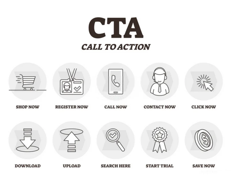
We go immediately to the definition.
What is CTA and what it is for?
Let’s start with the basics, CTA is, as I explained, one of the most important keys to your marketing strategy.
Your visitors will learn more about your articles, pages, brochures, emails, flyers … and website. Then comes the time when you want these visitors to take action, buy or try your products or services.
It is this step that is commonly called the conversion rate when your visitors turn into qualified customers or prospects.
They can go through different steps to be converted, whether it’s buying your products, signing up for your newsletter, downloading your free guide, and many more.
The role of call to action is therefore twofold
It must first attract attention, your call to action must be visible and recognizable to be effective. It should be distinguished as much as possible from the rest of the page content so as to create a contrast.
All this is, of course, not sufficient to capture and maintain attention, the CTA must also be linked to the page visited and above all offer an optimized, congruent offer adapted to the needs and expectations of your customers or prospects avatar.
It is also for this reason that it is important to define the types of profiles of customers who are likely to buy/subscribe to your products in order to be able to target them better.
Optimizing targeting thus makes it possible to better convert and it is also one of the roles of the call to action.
The more information you gather about your prospects/customers’ likes & dislikes, the more you can use this info to better optimize your offers and CTA’s. It is also important to send emails to your qualified prospects to invite them to add additional information with surveys and quizzes in exchange for a reward (Ebook, reduction code …) in a win-win perspective.
The different ingredients of an effective CTA
The big advantage of CTA is that it adapts perfectly to the different media that you want to use such as newsletters, blog articles, and even social networks.
The design of your calls to actions
As said above, design should be treated and distinguished from the rest of your content. You will never see a trader displaying a promotion at the back of his store. It’s exactly the same for your CTA
To put it forward, you have different options. It may be interesting to use an image instead of a single button, which makes it easy to get the visitor’s attention.
There are also colors that attract the eye. According to studies, the colors to be preferred for having the most optimized CTA possible are orange, red, and green. Be careful, however, that the colors of your call to action are consistent with the rest of the content.
Use the right terms.
The message on your call to action should be very clear. When a visitor arrives, he must directly know what it is and what he is about to buy. If the offer is not clear, there is no chance that your visitors will buy anything.
Remove anything that is unnecessary and superfluous to focus on what goes straight to the point.
You must be looking for a short and impactful message. To do this, it is recommended to use and favor action verbs such as:
Sign up.
In this type of CTA, the audience might be invited to sign up for a free trial, an online course, a future event, or even a software product. It all depends on the CTAs context on an ad or website.
Subscribe.
This CTA doesn’t commit a person to purchase. Rather, it invites them to receive updates from the company. “Subscribe” CTAs are common to company blogs, for which the business wants to develop a readership.
Try for free.
Nearly every company website has a free trial offer today. Each of them is CTAs of this variety, and they allow people to demo a product before deciding if it’s worth the cost to them.
Get started.
This CTA can drive a variety of behaviors for a company, from a free trial to a virtual reality experience.
Learn more.
Sometimes, all you want is to give your potential customers a little more information so they’re prepared to buy something. That’s what this CTA is for.
Join us.
Do you manage an online community? Is your product built on collaboration between users? You might find yourself placing a “join us” CTA somewhere on your website.
For each of these terms, always use the infinitive, the imperative (register), or the present (I download).
There are also certain words that greatly increase the interest of the reader such as:
- Free is the most powerful word in marketing, use it as often as possible when it is relevant.
- New, the brain loves novelty, this word fuels the curiosity of the reader.
- Proven, it is a way to gain the trust of the reader. If you can support your arguments with scientific studies it’s even better.
- Guaranteed, another way to put the visitor in confidence and prove to him that the purchase poses no risk.
Remember to introduce the concepts of exclusivity and time-limited offer. Emergency and rarity strongly encourage clicking, these arguments are therefore of formidable effectiveness. Some examples of terms to use:
- Reduction only for the first X buyers,
- More than X minutes to take advantage of the offer
- Limited stocks
To increase the effectiveness of these arguments, you can also mix them.
Example:
- Reduction for the first X buyers during X minutes.
Choose the correct location
In addition to the design of your site, your CTA must be located in the right place at the risk that your prospect does not even see it.
Some areas are ideal while others are highly disabled.
Some studies have shown, for example, that putting a CTA in the middle of the page can increase the conversion rate by more than 280%!
More generally, it is recommended to put these calls to action at the end of the article or just below the waterline. Be careful not to put too many calls to action on your page, which reduces the readability and optimization of the user experience.
Some people use pops-ins on their sites where they place their CTAs. A pop-in is a window that automatically opens onto your visitors’ screens. This practice is debated and is considered by some people to be too intrusive and aggressive, but it can still be extremely effective. It’s up to you if this method can satisfy you. Be careful, however, to be careful with its use.
Misused, pop-ins can cause the totally opposite effect and scare away all of your readers.
It is best to leave a reading time before displaying the pop-in with your CTA
Test what goes through your head
Obviously, you will not be able to create a perfect CTA and 100% optimized the first time. This is why the only really viable method to increase your conversion rate is to test.
The techniques to be used vary depending on your audience, your offer, your content, and many other factors …
Whatever your situation, try different strategies and sort out what works for you and what doesn’t. This is how the best CTAs are created and optimized.
And if, we went to put it into practice with even more concrete examples?
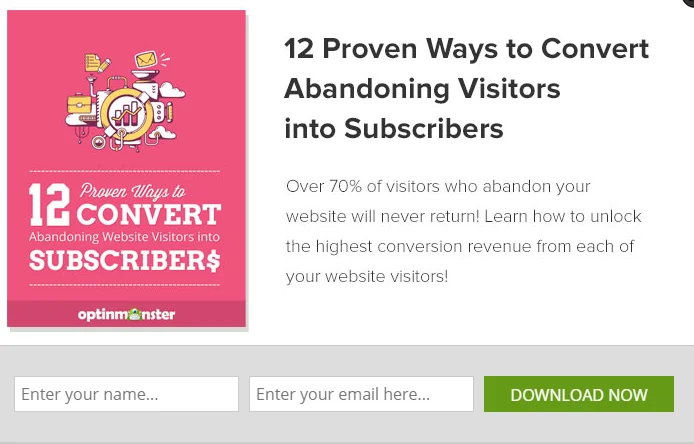
3 Examples Of Calls To Action
1) Apple
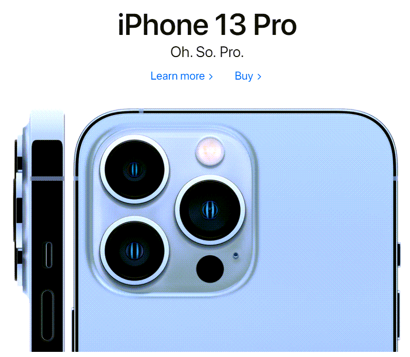
If we go to Apple’s home page, we can see not one, but two calls to action, side by side.
On the one hand, you have: “Learn more >” and on the other “Buy >“. (Apple continues to test this. “Know more > Buy >” was there last time I looked).
Personally, I do not recommend the “Buy” link or button unless you have an e-Commerce site and again because it is too direct, a source of friction, and non-positive perception.
Apple can afford it thanks in particular to brand image, strong branding, positioning, and notoriety.
Note the strategic choice of color contrast, size, position, and font. The “Buy” link is on the right and it is no coincidence. Indeed, the “Learn more” button combined with the arrow invites the eye of the prospect to go towards the “Buy” link.
As you can imagine, nothing, absolutely nothing, is left to chance.
2) Clickfunnels

Clickfunnels ![]() is one of the leading software for creating sales funnels (landing pages, sales page, order form, etc.).
is one of the leading software for creating sales funnels (landing pages, sales page, order form, etc.).
When you go to the home page, you can see this button:
It catches the eye. It is large enough and contrasted. It is precise with clear action combined with a sense of urgency :
“Start Free 14 Day Trial Now“![]()
(As with Apple, Clickfunnels are continuously testing their CTA’s, “Start Your Free 14-Day Trial Now” ![]() is another variant they’ve tested).
is another variant they’ve tested).
There is an interesting trick in this case, which is why I chose to share it with you: the double call to action.
Indeed, as you can see, there is a confirmation of the first call to action in the button which allows you to add an argument and an additional source of motivation:
“Start building your first funnel right now!“. (“Start building your first funnel right away.”)
Note that the classic term “enroll” has been banned to make way for a clearer, more precise, and more worked value proposition.
3) Tony Robbins, the international coach
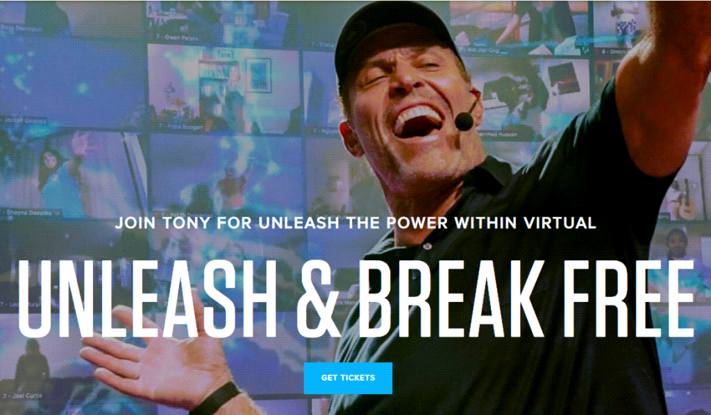
Find out immediately the call to action from the home page of Tony Robbins, the famous American coach.
The last call to action is strategic because, very often, the Internet user will be lazy to go up the page. Therefore, he will either take action or leave the page.
In this example, we find a call to action ultra short in 2 words: “GET TICKETS” (Another variant of “Start Now” also used/tested).
You start to see similarities and a trend, right?
Conclusion
A call to action is a text or a sentence that gives, in a precise manner, the action to be carried out and the way to accomplish it.
It can be short, generic, and dynamic, or longer, more complete, and more developed.
It is found, almost systematically, on the capture pages, the presentation pages, the sales pages, social networks, sales videos, flyers, leaflets, brochures … in short, in any marketing communication.
Creating, writing, or writing an effective action call is essential, whether you are a consultant, coach, therapist, speaker, trainer, entrepreneur, service provider, freelance …, whether in your communication on the internet or offline.
Methodical and strategic optimization of your calls to action alone can drastically boost results and dramatically increase conversion rates, which is more, without spending more than a few minutes.
The call to action constitutes a central pillar of copywriting which is very often botched, zapped, or underestimated.
Optimized calls for action not only optimize short-term results but also have a positive impact on influence in the medium and long term.
In short, writing or writing calls to action (CTA) that convert will make you different from the competition, and increase your results while conveying a positive perception of your activity or offer.
Optimize and test new calls to action to form your own opinion.
Be careful, the calls to action worked can be great assets, but it is not the quick fix either. Indeed, they constitute a central part of the puzzle which goes hand in hand with other elements which must also be mastered such as positioning, message, branding, supply, design …
The vast majority of the time you should be testing your Calls-To-Actions using BIG, BOLD BUTTONS or “Compelling Headline” type calls to click on a text link or subscribe, etc.
Other CTA’s can be more subtle, almost hidden CTA’s sprinkled throughout your content.
